(+44) 7842798340
Call us for enquiry
-
-
Connect On Whatsapp (+44) 7842798340
Uninterrupted Access 24x7, 100% Confidential. - Connect Now

The article is effective to understand scatter plots where the researchers can represent the data through graphical interpretation. The recent trend as well as the interrelationship between the variables can be analysed through the scatter plots.
A scatter plot is mainly a type of plot or mathematical diagram using Cartesian coordinates to display values for typically two variables for a set of data. If the points are coded, one additional variable can also be displayed. Scatter plots' is primarily utilised to observe and show the relationships between two numeric variables. The dots in a scatter plot not only report the values of individual data points but also patterns when the data are taken as a whole. Hence, the relationship between the two variables can be analysed and it is considered as a descriptive-analytical tool where the researchers can compare and variable data counts through the graphs. Moreover, the interrelationship between the dependent and independent variables are also analysed well through a scatter diagram, where the X-axes represent dependent or Y axes refers to the independent variable. Putting the gathered data on the scatter plots will show the trend of the data and it will provide scope to the researchers to analyse the impacts of the independent variable on the dependent one in the data set. Hence, it is widely utilised by the researchers to conduct diverse researches including marketing and sales, finance, pharmacy and health care, market research and biology, to represent the gathered data and provide in-depth critical interpretation.
The researchers can utilise an excel spreadsheet for scattering diagrams to represent the values, and on the other hand, the r language is also utilised where the researchers focus on using scatter plots in r for further critical analysis. Graphs can either have a positive correlation, negative correlation or no correlation, where the dots represent the interrelationship between two variables. If the line is upward sloping, it means there is a positive correlation between the variables and on the other hand, the downward-sloping line as per the dots in scatter plots represent a negative scatter plots correlation between the variables in that data set. The basic syntax for creating scatter in R is such as,
Plot(x, y, main, xlab, ylab, xlim, ylim, axes)
For example, if we consider the scatter diagram below, there is an ammonia concentration per year. there are two variables, ammonia concentration and year. The dotted line represents data of ammonia concentrate against each year.
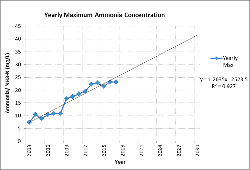
The straight line is an upward sloping line, which represents that over three years, the ammonia concentration is increased.
Hence, a scatter diagram is a graphical representation of the gathered data and information, where the two variables are represented in the X and Y axes. The researchers try to identify the interrelationship between the two variables, to analyse the data efficiently for final programme evaluation. Scatter plots are utilised for descriptive statistics and it is also utilised in r for representing the data and evaluating the interrelationship to analyse whether there is a positive or negative correlation between them. It is important to have an understanding of SPSS properly. Our expertise provides you with SPSS help and is tailored to help you understand scatter plots and how to represent your research on them. You can contact our SPSS experts by filling the request form and we are available to assist you–regardless of your specific research design.